
Welcome to this, the first of our new series of posts about watch design development. Throughout this blog, we plan to take you through Crispin Jones' (AKA Mr Jones) inspiration and design processes, revisiting our existing designs, and learning about how watch designs are developed. In this first post, Crispin talks us through The Cyclops watch. Cyclops has been our most popular model since it was released in 2009.
The inspiration for the design of Cyclops came from another watch - the Chromachron designed by Tian Harlan. Harlan is an artist not a watchmaker.
My understanding is that Harlan created a sculpture for the 1972 Munich Olympics that was the precursor for the Chromachron watch (but I'm unsure on this as I've never seen any images of this clock). Munich was the true design olympics, the quality of graphic design and the artworks commissioned have never been equalled.

Tian Harlan believes that we don't really need all the precise time information that surrounds us. Indeed he believes that the rigid structure that timekeeping imposes on our lives is a negative phenomena and one that should be resisted. The Chromachron assigns a colour to each hour and has a wedge shaped hour hand that you read the time from. Time telling is slightly more approximate than with a conventional watch (you can tell the time to within about 5 minutes, rather than to the exact second).
Harlan's philosophy is quite playful (if a little disingenuous), in the little book that serves as the packaging for the watch he writes:
Harlan's philosophy is quite playful (if a little disingenuous), in the little book that serves as the packaging for the watch he writes:
Everybody has a watch.
But nobody has time.
Because time runs away in seconds.
It is time for another watch: The Colour-Time-Watch.
The day has 12 colours.
According to the light from morning until evening.
Each colour is an hour.
Each colour part is part of an hour.
Suddenly the moment matters.
All at once it is shortly before yellow.
And no longer five to twelve.
Before I started designing watches,
I wore a Chromachron (this was the first watch I wore after many years
without one). I discovered the watch online and really fell in love with
it - both the visual appearance and the philosophy. The watch I wore
was one of the 1980s quartz reissues, but pictured here is an original
1970s mechanical version. In 2009 I was thinking about the new designs and
wanted to make my homage to the Chromachron.

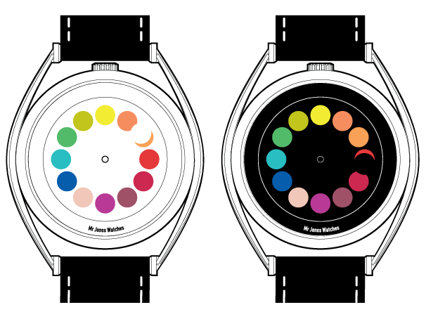
Pictured above is the first page of sketches I did for the Cyclops design - one of the colour palettes is from the Chromachron, but I decided quite quickly that I wanted to use my own palette. My plan with the design originally was to have a white dot for the hour hand (See picture below). The time would be read from the eclipse shape that this dot formed with the coloured hour circle. We sampled this, but the illusion of the hour marker blending into the dial was not very convincing (the white of the hand was different from the white of the dial, so visually you didn't perceive the colour shape, but rather just saw the dot).

So there you have it. We hope this gives you something of an insight into our design inspiration and development. Next week we will be talking about another of our unique watches, so stay tuned...
No comments:
Post a Comment